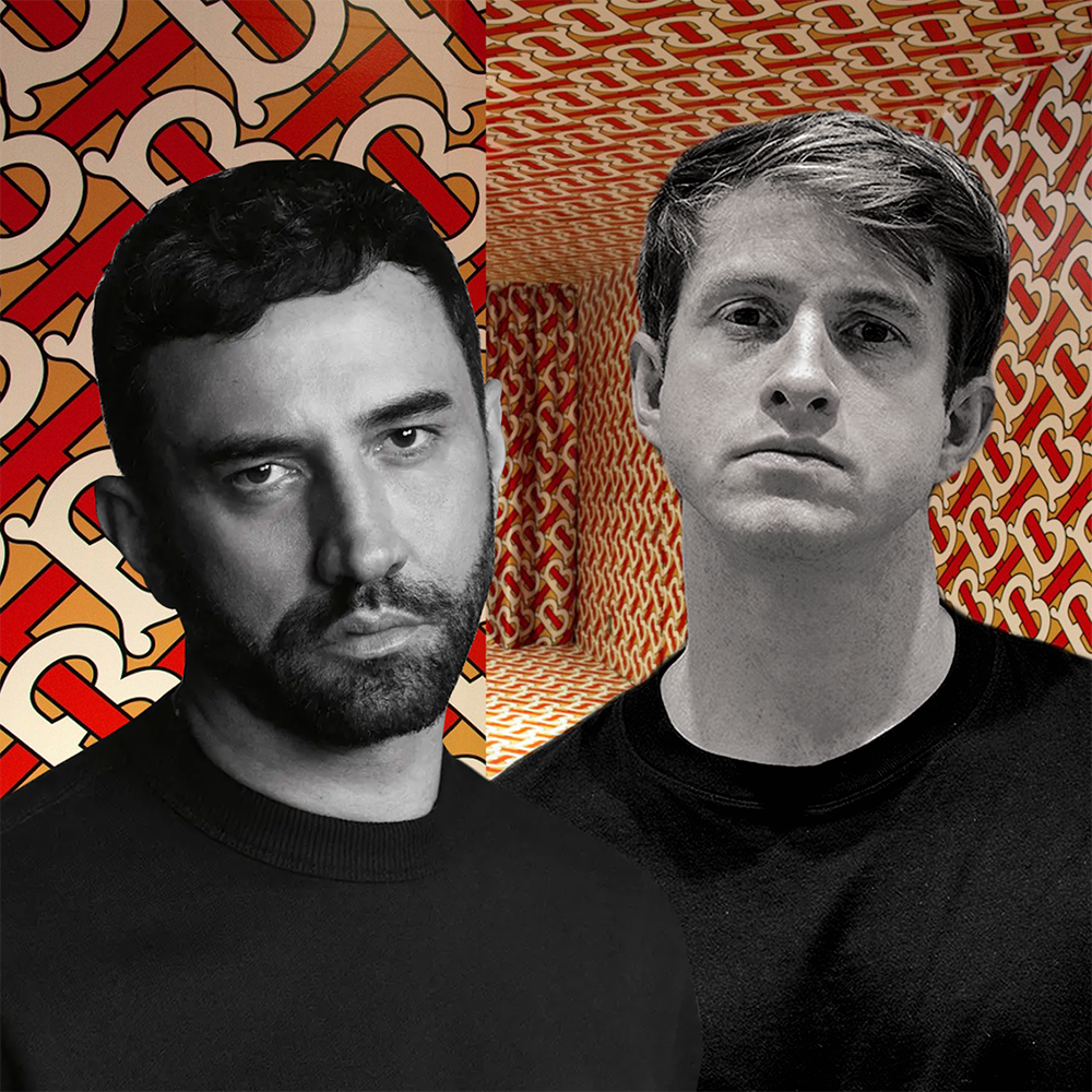
Some people get sick when many brands “change their identities like changing clothes” every time they have a new Creative Director. Is Daniel Lee just trying to be different from his predecessor Riccardo Tisci?
Quitting the minimalist brand identity trend that has lasted for the past decade, Burberry has just made a “breakthrough setback”. After only 4 months of leading the brand under his direction, in February, Lee definitively “flipped” the Sans-serif style that the fashion house has been attached to since 2018 under Riccardo Tisci. Instead, this luxury fashion brand decided to return to the traditional Burberry font, with the 122-year-old image of an equestrian knight, bold with British culture and symbolism.
The “Prorsum” on the knight’s flag (Latin for “forward”) was the name of a diffusion line of Burberry signature products from 2000 to 2010. Although Burberry Prorsum was discontinued in 2015 after merging into the main line, it looks like Lee is bringing it back. Even so, Burberry has yet to confirm the exact plan.
BREAKING THE “OUTDATED MODERNITY”
Traditionally, luxury brands have always appeared with elaborate and over-detailed lines. Until the tech era with a clean, minimalist style emerged, the label of “sophisticated luxury” was gradually removed. High-end fashion brands like Berluti, Balmain and Saint Laurent also joined the trend, moving into Sans-serif styles.
Tisci expressed that the brand needed a logo that would work well on the chiffon collar as well as the lining of the raincoat. And that’s probably how we can sync everything. Logos, especially those of modern luxury brands, shouldn’t just sit on shelves. They are on clothing, accessories, embroidery, websites, homewares, or Instagram,… and they need to be legible and recognizable on all platforms. The less complex the better.
While the purpose is to make the word more readable, more digitally compatible, Sans serif is considered too monotonous, lazy or even “rude”, which kills the personality that a luxury brand should have. It is clear that Lee’s intention was to redefine the concept of tradition, emphasizing the inheritance and the essence of England. This new logo is declared by the brand itself as “archive-inspired”.
“Today Britain is much more cosmopolitan, there is a little bit more of an edge to it, a different spirit… Daniel is thinking hard about who are the icons of Britain today, he’s got some really exciting ideas. I promise you, you’re going to see an incredibly strong brand image.” said the brand’s CEO Jonathan Akeroyd.
By Hoang Dao
Reference esquire.com
creativebloq.com
designweek.co.uk
Image source 1000logos.net
businessoffashion.com
nytimes.com